Wednesday, 24 November 2010
Vector junkie
I love the way this illustrator deals with line and block colour. Everything looks juicy and oily, but then also gets complimented by tasteful gradients and blending techniques. Makes for a really effective and vibrant image.
Promotional design for miss selfridges
Less is truly more. Beautifully executed typograhy co exisiting in harmony with illustration that is amazing. I want to be working towards my range of promotional products coming together something like this using bleeds, block colours with type and tight margins on documents. it works very well indeed, and the multi coloured papers gives it that sublte breath of life it has. Beautiful stuff, This has got me fired up to keep developing my layouts until theyre hitting a similar standard.
Painted Mural
I Found these images on the Behance network, but failed to get the name of the illustrator at hand, so i apologise for that, but I love this illustration, the rendering is amazing in the way that it transitions from simple block colour in the clothing of the character into tonal beautifullness for the face. Proper rad image making skills. The double outline is also really working well - alot of the time I dont like a double outline on characters but this works well in this instance. I need to start considering what is out there in leeds in terms of art on wall space and how it works in a variety of contexts to help inform my own mural for rebel pin up.
Famous Brazilian Sporting Heroes
I posted these images up purely for the beautiful colour combinations and the way it is rendered. The rotoscoped feel works well and contributes to a striking image overall. I have been considering this approach to rendering illustrations throughout the process of my rebel pin up brief.
Sam Green - Illustrator's promotional mailer
The fold method used here clearly showcases the work well and the type lends itsself to the illustration really effectively. The use of stark black type enhances this fold method and gives the overall product a really proffessional feel. This man is clearly someone who loves what he does, but is also very serious about it. It's this kind of tone of voice I want to communicate with my rebel pin up promotional materials.
The monotone and selective colour really does help enhance this product, and the poster on the back is a good idea to show the best piece of work off well.
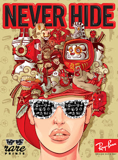
Rare Print - Ray Ban
Amazing digital illustration advertising ray ban sunglasses. What strikes me most about the illustration itsself is the use of colour and the combination of more comic and realistic visual approaches split across the top and bottom of the page, which works really well. It is good to see how logos have been applied to this as an overall image too.
Subscribe to:
Posts (Atom)


