Sunday, 28 November 2010
Saturday, 27 November 2010
Workshop post 2
A little lookbook for a photographer and also some T - shirts that are part of a space range. I'm looking at this because I would love the publication about UFOs I am doing to take a turn like this look book. But I also love the bespoke type that workshop have developed for these T- shirts.
I think its the cover that I like most about the lookbook, the way that the image takes presidence over a small amount of title type. I think it looks really sophisticated. This design will be informing my decisions for a front cover for my publication.
Onlab
Some layout design for a publication by Onlab. To me at a first glance this layout looks a little bit all over the pace, but the more I look at it , the more it has an appeal with its over set type and image combos and text wrapped around scattered images. I want to make sure the layout of my publication is interesting and angaging enough on a visual level but it also has to be equally as legible and functional.
Stour Kramer
I love this work by Stout Kramer, there looks to be two grids going on here, on for the black body copy and images, and then another for the red - possibly over printed? It looks great whatever the case. It's simple, cler and functional. I dont think that I need to go down quite as much of a minimalistic route with my publication, but it is clear to see here that if you get your foundations right from the start, the rest falls into place whether you choose to include it or not.
More stunning publication design
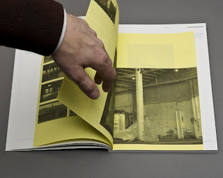
Khio's This Way Forward designed by YourFriend. Some of the type Layouts in this book as you can see are really interesting. Its clear to me from looking at this that you dont have to overload every page choc full with information, and its ok to hardly have anything on a page at all, as long as it is executed well.
Another nice touch here is the consideration of multiple stocks indside the book itsself. I like the way that the yellow stock interacts with the white stock behind it, as the scale and format of the two slightly differs. The relationship between the front and the book here is also effective as it adds to the overall harmonious uniformity of the overall publication.
I have been considering using multiple coloured stocks at different formats for the publication I am designing at the moment.
MUST publication by multiple owners graphic design
I just wanted to post this up on here because they included images of their grids on the original post. I Always think it is really interesting when you can see how others are working, and then what the final ends up looking like. A really good insight into another's practise when it comes to publication design.
Carry Hope Print by SAWDUST
A run of exceptionally well finished tote bags by SAWDUST. The imagery and illustrated type is beautiful, especially the BEAT tote. I would like to experiment with doing some type like this for the cover of my publication. I also put this up to show how SAWDUST dealt with the distribution of their totes, in the form of a publication.
Workshop retail design research.
Ollie &Tom look as if they are doing really, really, well for themselves with their company: Workshop. So first off, really well done guys!
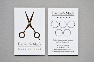
These are two projects from Workshop : One is a loyalty card for A Barber (Barber & Mack). It is nice because it is just simple design with the foil logo on the reverse. The foiled idea I like alot and still want to persue, but it has made me decide the loyalty card I have made needs another look at. Theres like 3 bits of ingormation of the workshop design, which is really effective, and direct as a piece of design.
Auburns retail environmental design and branding: The signage is simple and effective. With the logo taking dominance over any other information, which is the way it should be.
Wednesday, 24 November 2010
Sam Green - Editorial
A submission for Popshot magazine by Sam Green. Popshot is a publication that combines poetry with illustration across double page spreads. Again, some outstanding craftsmanship using only pencils, but this is somehting I should be starting to think about in terms of how an image relates to type. The high quality of this illustration also scares me into beleiving there is so much room for improvement with my illustration. I will get there, eventually.
Artist's Sketches
Some images I found on behance of an artist's sketchbook. The intricacy and precision of these illustration is a bit on the mind blowing side, Im also very jealous as I would love to be able to do this by hand. The images would work very well as vector images which would then be scalable. It makes me glad that I have decided to produce vector artworks for this rebel pin up brief because it does mean that I can apply my illustration to a range of formats with no limitation to scale at the highest quality consistantly.
Subscribe to:
Comments (Atom)


